Page Layouts
Overview
- Overview
The Layout Builder allows administrators to visually create and manage page structures by arranging:
- Layouts (Fullwidth, Content, About, Login, etc.)
- Sections
- Rows (Columns)
- Elements / Blocks (Heading, Text, Image, Grid, Button, Slider, etc.)
You can build complex pages without coding by adding and organizing these components.
Page layout builder
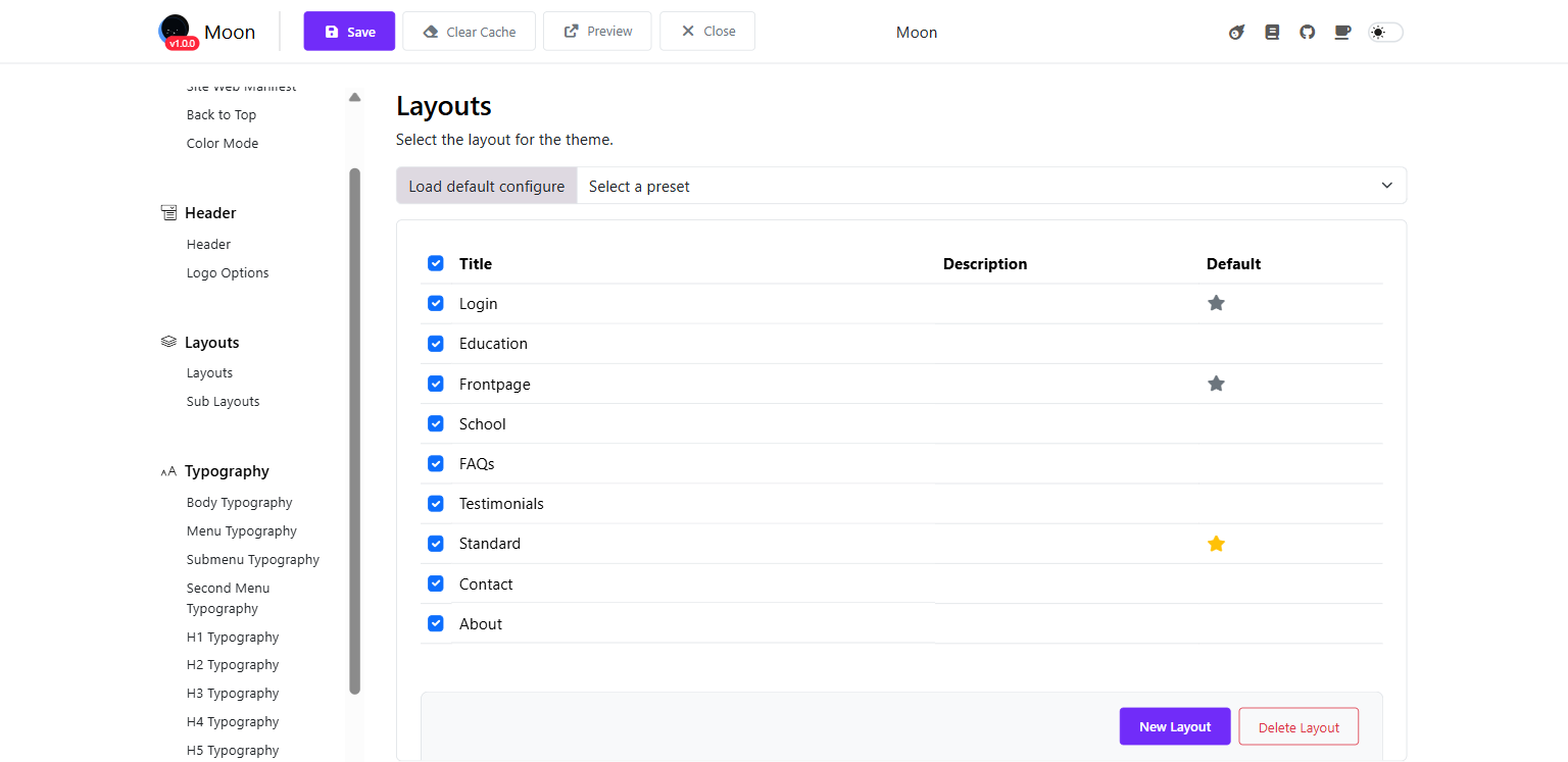
When you come with pages such as: Home pages, About, Contact, Testimonials > Login, and FAQs, please heading to
- Log in to the Admin Dashboard > Site Administration > Appearance > Themes
- Edit Moon theme's settings > Layouts
- Select the layout you want to edit (e.g., About).
- Click to open the layout builder interface.
- Layout Tabs
You can manage multiple layouts using tabs by switching between layouts by clicking the tab, or create a new layout.
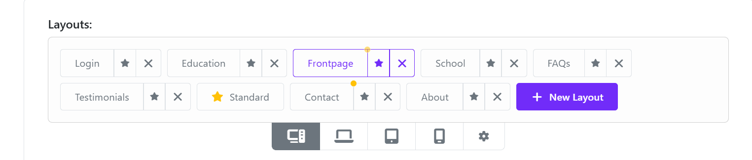
- Edit the layout title: Click on the Edit info button in the bottom bar
- Default layout: You can set a layout as default by clicking on Mark As Default button
- Understanding the Structure
The Layout Builder works in three levels:
Layout └── Section └── Row (Column structure) └── Elements (Content Blocks)
- Managing Sections
Each page is built using Sections.
3.1 Add a New Section
Click + New Section inside the layout.
Choose column structure (e.g., col-lg-12, col-lg-6, etc.).
3.2 Section Controls
Each section includes action icons:
✏ Edit section settings
📋 Duplicate section
🗑 Delete section
🔼 Move section
➕ Add new row
3.3 Reordering Sections
Drag and drop sections vertically to change position.
- Managing Rows & Columns
Within each section: You can define column width (e.g., 12, 6-6, 4-4-4). Add multiple rows inside a section and adjust column layout for responsive design.
- Adding Elements (Blocks)
Inside each row, you can add content elements such as:
- Heading
- Text
- Image
- Grid
- Button
- Slider
- Testimonials
- Video Button
- Blocks
- Main Content
- Menu Backend
- Course Category Tab
5.1 Add an Element
- Click the + icon inside a column.
- Select the desired element.
- Configure its settings.
- Click Save.
5.2 Edit an Element
- Click the element block.
- Modify content, styling, or settings.
- Save changes.
5.3 Duplicate or Delete
Use action icons to duplicate or remove elements.
- Special Sections
6.1 Header Section: the header section controls Logo, Navigation, Menu backend, Top bar 6.2 Main Content: Displays dynamic page content (e.g., course listings, blog posts).
Important: Removing Main Content may prevent the page from displaying its core content.
6.3 Footer Section: Usually built as a Sub-layout and inserted into the page layout.