Button
The Button Widget in Moon Framework allows you to create stylish, customizable buttons that link to internal or external pages. You can also configure icons, styles, sizes, and even dynamic content for enhanced flexibility.
📌 Where to Find It
- Go to your Moodle Administrator > Appearance > Themes > Moon theme's settings
- Open the Layout tab
- Add a new element > choose Button widget
⚙️ General Settings
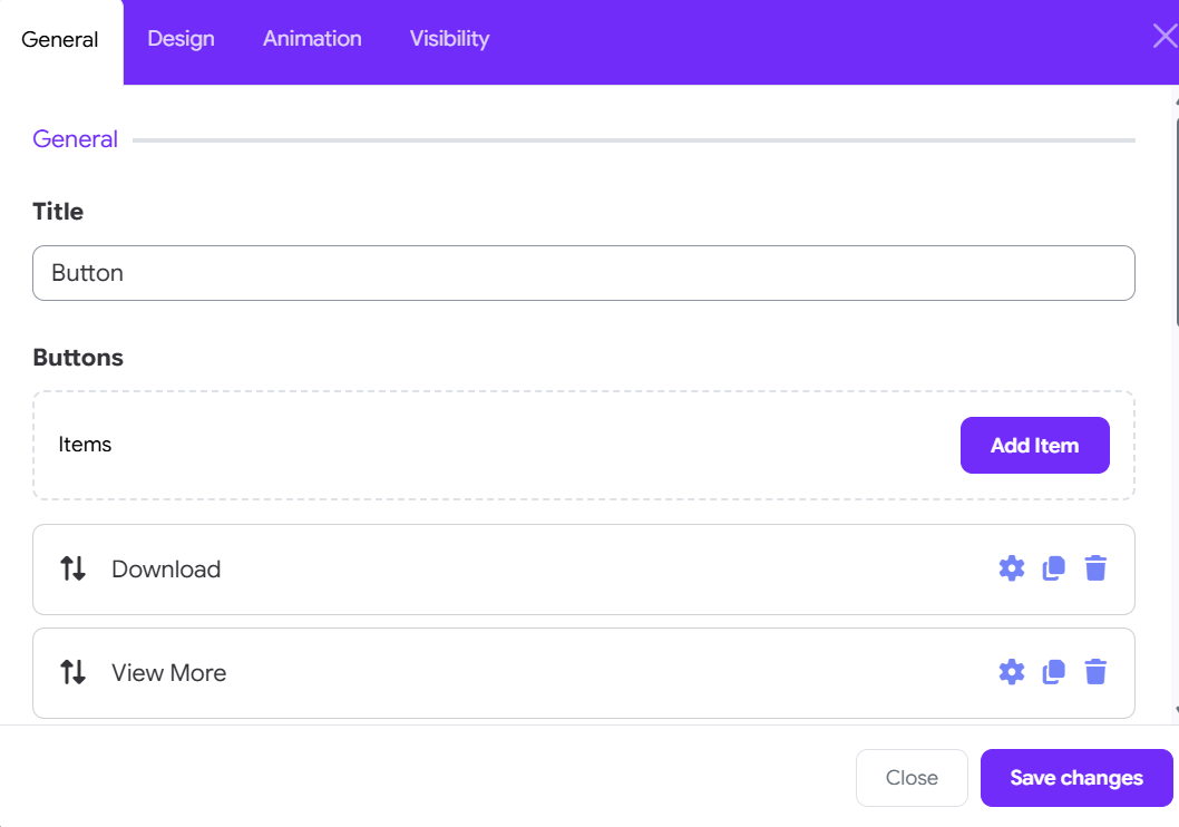
Click on the Add Item button to add a new button
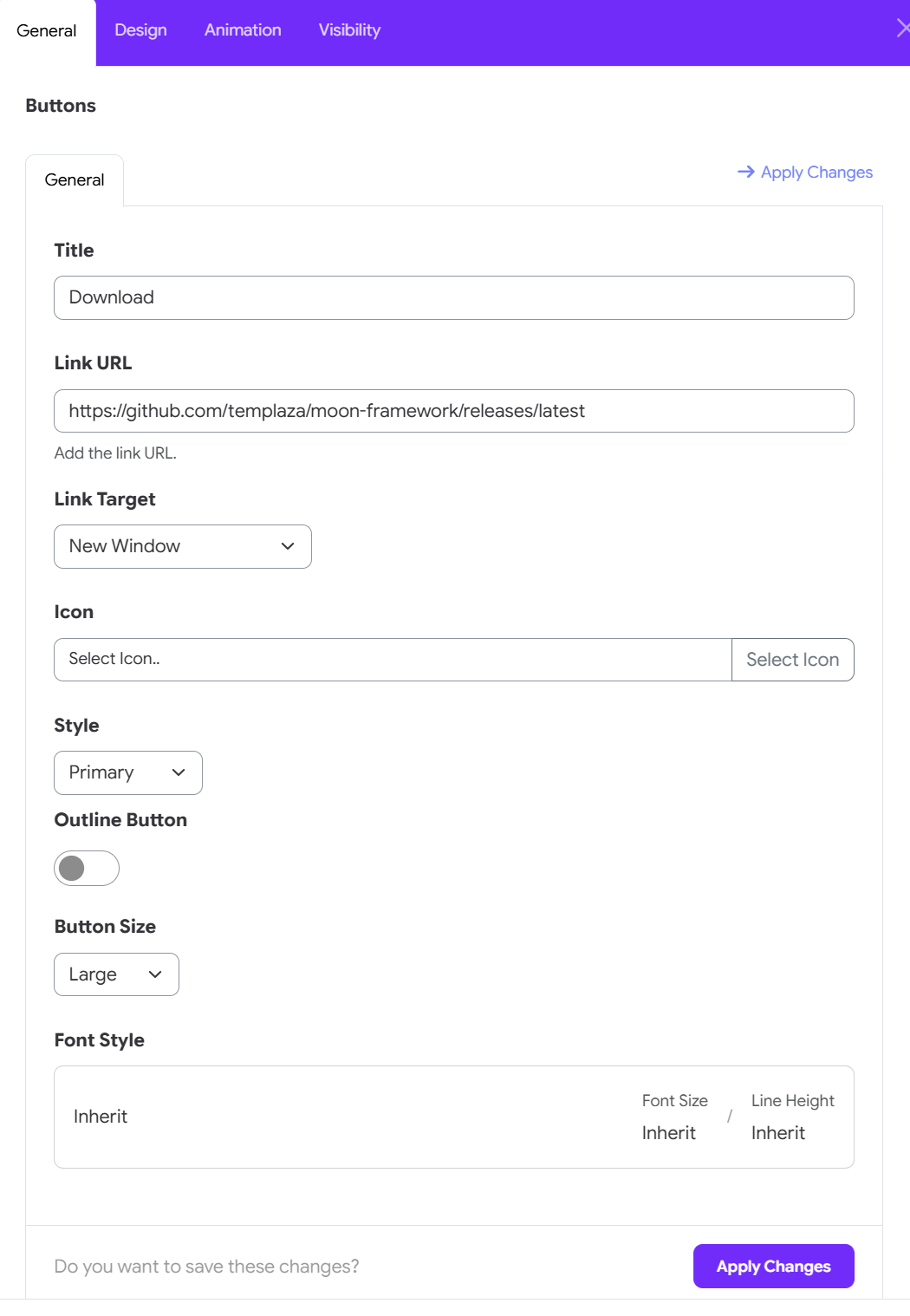
Title
- This is the visible label of the button.
Link
- The URL the button will point to.
- You can use any internal or external link (e.g.,
https://astroidframe.work/).
Link Target
- Choose how the link opens:
Default: Follows the normal behavior._blank: Opens in a new window/tab._parent: Opens in the parent frame._top: Opens in the full window.
Icon
- Add an icon next to the button label.
- You can choose from the icon library.
Style
- Choose from default Bootstrap button styles:
- Primary, Secondary, Success, Danger, Warning, Info, Light, Dark, Link, Text, Custom.
Outline Button
- Outline: Toggle an outline style.
Font style
- Configure font style of the button text.
🎨 Widget Styles
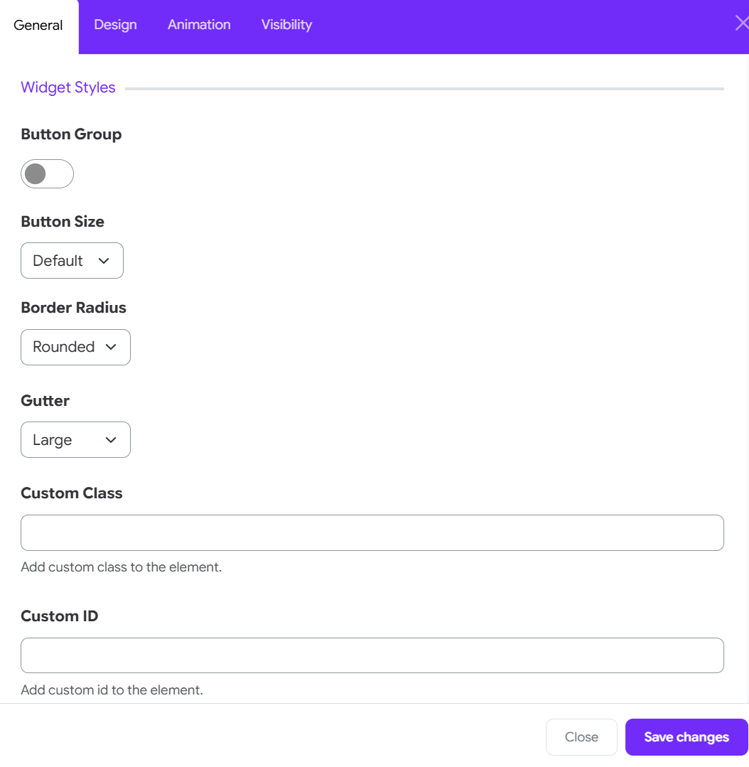
Button Group
- Toggle to group multiple buttons together for aligned display.
Button Size
- Default
- Large (
btn-lg) - Small (
btn-sm) - Custom
- Font family, font size, and line height can be adjusted.
- When size is set to Custom, you can manually adjust padding.
Border Radius
- Choose from:
- Rounded (default)
- Square (
rounded-0) - Circle (
rounded-pill)
Gutter
- Adjust spacing between buttons in group layout.