Text Widget
The Text Widget in Moon Framework allows you to add and format text content within any section of a Moon Layout Builder layout. It is useful for headings, descriptions, introductory content, announcements, and other text-based content.
The widget provides controls for text content, HTML heading levels, typography, spacing, responsive settings, custom classes, and custom IDs.
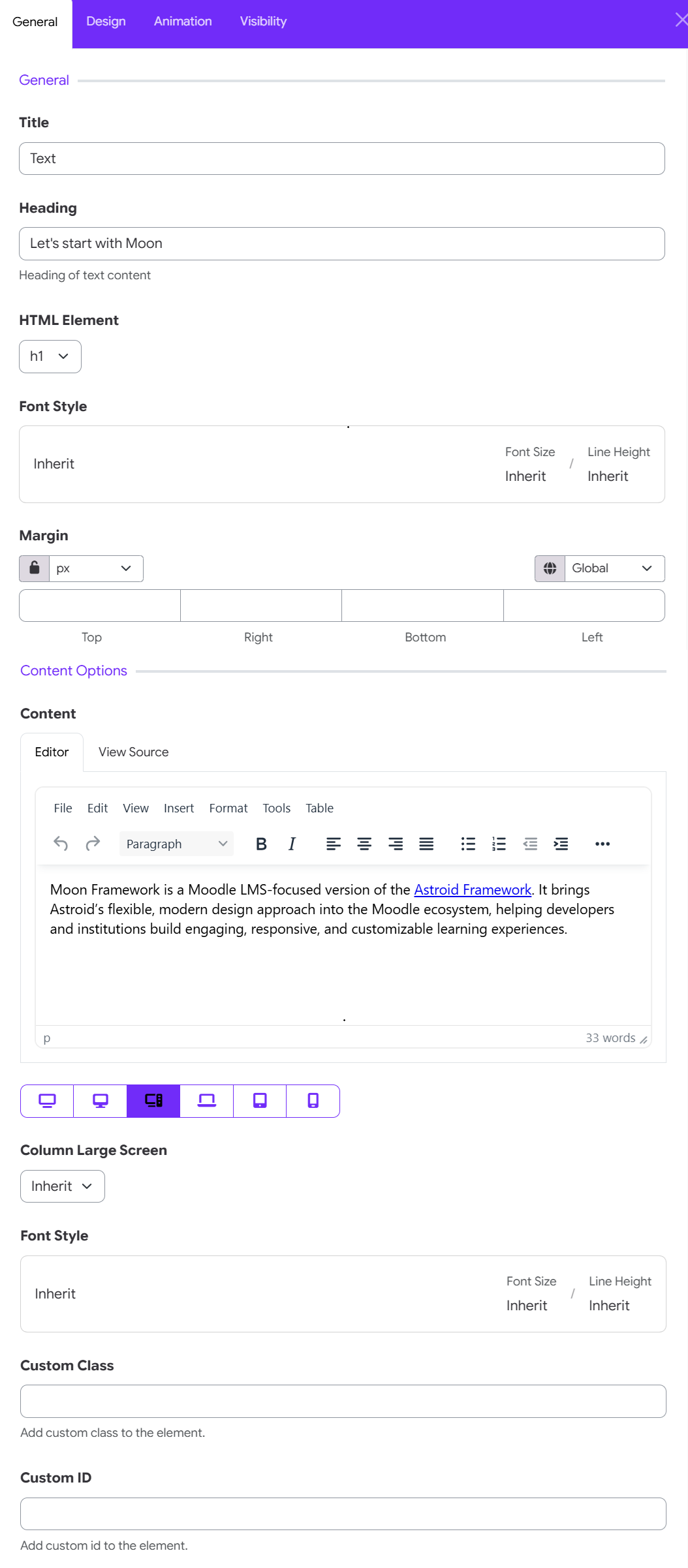
1. Add the Text Widget
To add a Text Widget to your layout:
- Open the Moon Layout Builder.
- Open an existing layout or create a new one.
- Select the Section, Row, and Column where you want to place the text.
- Click Add Element.
- Select Text.
- Open the Text Widget settings.
- Configure the content and design options.
- Click Save changes.
2. General Settings
The General tab contains the main settings for the Text Widget.
Title
The Title identifies the widget within the layout builder.
For example:
- Text
- Homepage Introduction
- Course Description
Heading
The Heading field allows you to enter the main heading associated with the text content.
For example: Let's start with Moon
Use this field when you want the Text Widget to display a heading above the main text content.
Example
Heading:
Let's start with Moon
Content:
Moon Framework is a Moodle LMS-focused framework designed to help institutions create engaging, responsive, and customizable learning experiences.
This creates a heading followed by descriptive content.
HTML Element
The HTML Element setting determines which HTML heading element is used for the heading.
The available options can include standard heading levels such as:
- H1
- H2
- H3
- H4
- H5
- H6
Choosing the appropriate heading
Use heading levels according to the structure of your page.
H1 → Main page heading
H2 → Major section
H3 → Subsection
H4 → Smaller subsection
Recommended practice
Avoid using multiple H1 elements simply because you want larger text. Heading levels should represent the logical structure of the page.
For example:
H1
 ├── H2
 │    ├── H3
 │    └── H3
 └── H2
This also helps maintain a meaningful document structure for accessibility and search engines.
Font Style
The Font Style control allows you to configure typography for the heading. The control displays the inherited font settings and provides information such as:
- Font
- Font Size
- Font weight
- Letter Spacing
- Line height
- Font color
- Text transform
- Font style
When the values are set to Inherit, the widget uses the typography settings inherited from the global settings.
Use Inherit when you want the Text Widget to follow the site's global typography. This is recommended when you want to maintain consistent typography throughout your website.
Custom typography
If the widget supports overriding the inherited values, you can specify different typography for a particular text element.
For example, you may make a homepage heading larger than the standard theme heading.
Margin
The Margin setting controls the spacing around the Text Widget. You can specify separate values for: Top, right, bottom, left.
For example:
Top: 20px
Right: 0px
Bottom: 30px
Left: 0px
This can be useful for creating additional space between the heading/text and other elements in the layout.
The lock icon allows you to link the margin values together. When linked, changing one value can apply the same value to the other sides. When unlocked, each side can be configured independently.
3. Content Options
The Content Options section contains the main text editor.
Content Editor
Moon Framework provides a rich text editor for entering and formatting your content. The content area provides two editing modes:
Editor
Use Editor for normal visual editing. This is the recommended option for most users.
View Source
Use View Source when you need to inspect or edit the underlying HTML. For example, advanced users may use source editing to create custom HTML structures or make precise formatting adjustments.
Tip: Only edit the HTML source if you are familiar with HTML. Incorrect markup can affect the appearance or structure of your page.
Column Device Screen
The Column Device Screen setting controls the column behavior for the selected large-screen breakpoint.
When set to Inherit, the widget follows the column configuration defined elsewhere in the layout. If you need the text element to behave differently at a particular breakpoint, select the appropriate responsive device and configure the column setting accordingly.
Why use responsive column settings?
Responsive column settings help you create layouts that adapt naturally to different screen sizes. For example, a layout might display:
Desktop
Text | Image
while on mobile it becomes:
Text
Image
Font Style
The Font Style setting can also be configured for the selected responsive breakpoint. This allows you to adjust typography according to the device.
For example:
| Device | Font Size |
|---|---|
| Desktop | 48px |
| Tablet | 36px |
| Mobile | 28px |
This is particularly useful for large headings that may look appropriate on desktop but become too large on smaller screens.
If no custom value is required, leave the setting as Inherit.
Custom Class
The Custom Class field allows you to add a CSS class to the Text Widget. For example: highlight-text
You can then target the element with custom CSS. For example:
.highlight-text {
    /* Custom styling */
}
This feature is intended primarily for users who need additional customization beyond the standard widget settings.
Custom ID
The Custom ID field allows you to assign a unique HTML ID to the Text Widget.
For example: about-moon
The ID can be used for:
- Custom CSS
- JavaScript
- Anchor links
- Targeting a specific element
For example, an anchor link can target:
#about-moon
A Custom ID should normally be unique on the page. Avoid assigning the same ID to multiple elements.