List Widget
The List Widget in Moon Framework helps you create styled lists with icons, descriptions, and various formatting options. It's perfect for displaying feature lists, contact details, or any list-based content in a customizable layout.
1. How to add the List Widget
- Open your layout editor, find the section where you want to place the widget.
- Click on Add Element.
- Choose List widget from the widget list.
2. General Settings
Add List Items
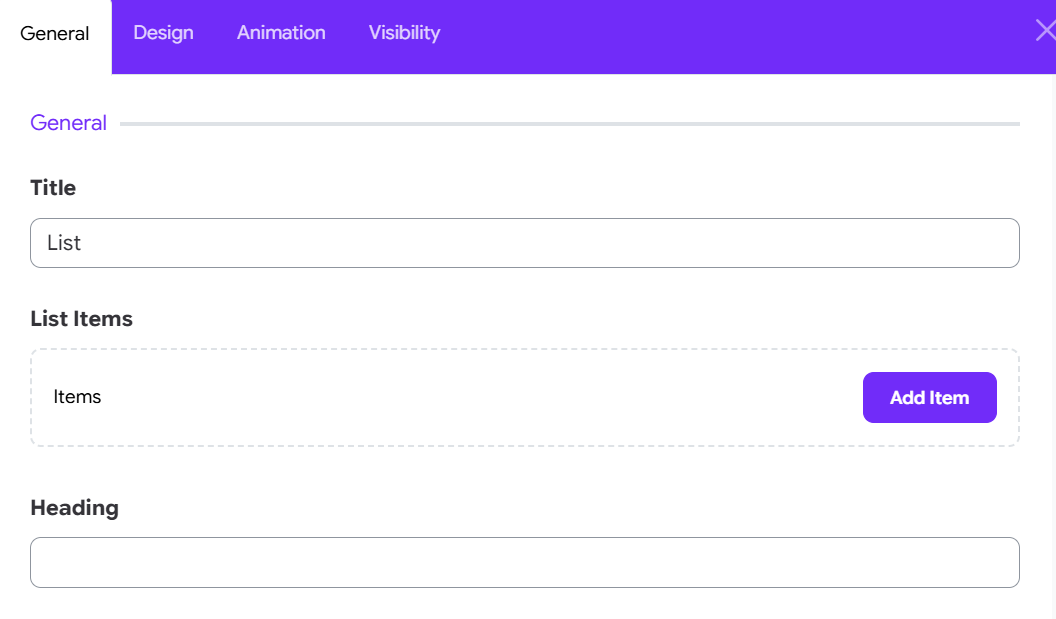
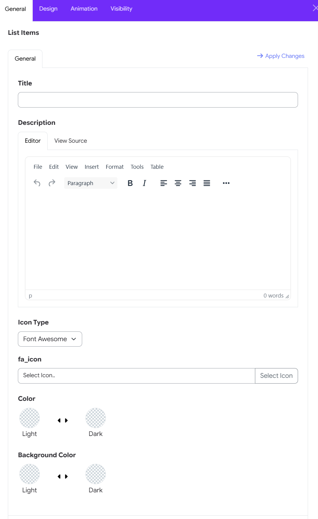
You can add multiple list items, each with the following:
- Title: Enter the main text for your list item.
- Description: Optional. Add supporting text under the title.
- Icon Type:
Font Awesome: Choose an icon from Font Awesome library.Custom: Provide your own CSS class for a custom icon.
- Fa_Icon: Select an icon or enter a custom class depending on the type.
3. Misc Options
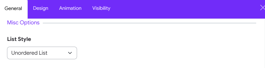
Set the overall style of the list using the List Style dropdown:
Unordered List: Default bullet list.Ordered List: Numbered list.Unstyled List: No bullets or numbers.Inline: Items appear inline.Description List: Items display as title-description pairs.List Group: Bootstrap styled group.List Group Flush: Removes padding.List Group Numbered: Numbered group list.
💡 If you choose Description List, you can also adjust the Title Width using a column range (1-12 columns).
4. Title Options
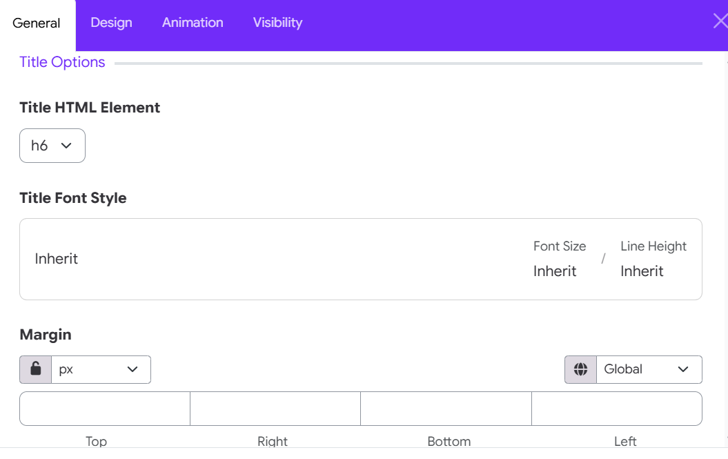
- HTML Element: Choose the tag for item titles (
h1toh6, ordiv). - Title Font Style: Adjust the typography for titles.
- Title Heading Margin: Customize spacing around the title.
5. Icon Options
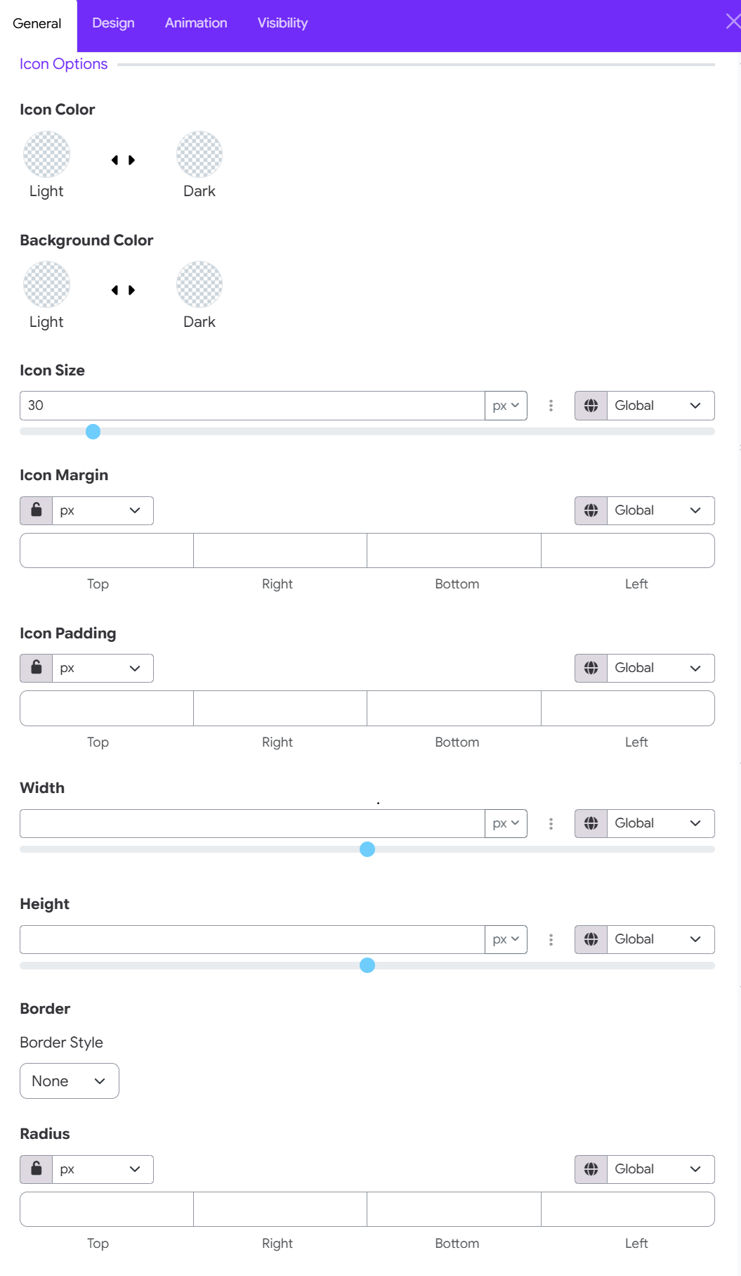
Color CustomizationIcon
- Color: Set the icon color for both Light and Dark site modes.
- Background Color: Choose the container fill color behind the icon for Light and Dark site modes.
Size & Container Dimensions
- Icon Size: Use the numerical input field or slider to set the icon glyph scale (e.g., 30px). Choose unit measurement (px, %, em).
- Width: Adjust the total width of the icon background container.
- Height: Adjust the total height of the icon background container.
Size & Container Dimensions
- Icon Size: Use the numerical input field or slider to set the icon glyph scale (e.g., 30px). Choose unit measurement (px, %, em).
- Width: Adjust the total width of the icon background container.
- Height: Adjust the total height of the icon background container.
Spacing & Margins
- Icon Margin: Control outer spacing around the icon container for Top, Right, Bottom, and Left edges.
- Icon Padding: Set inner spacing between the icon glyph and its background container border for Top, Right, Bottom, and Left edges.
Border & Corner Radius
- Border Style: Select an outline frame style for the icon box (e.g., None, Solid, Dotted).
- Radius: Customize corner rounding for the container box for Top, Right, Bottom, and Left corners.
- Controls: For Margin, Padding, and Radius, select your preferred unit (px, %, em) and use the Lock Icon to set all sides uniformly or individually.
6. Content Options
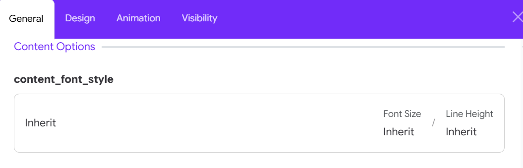
- Content Font Style: Adjust the typography for the description (if used).
7. Spacing Options
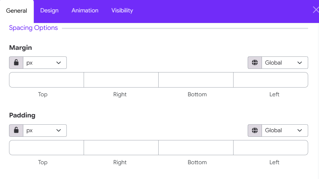
- Item Margin: Set the spacing between list items.
- Item Padding: Set internal spacing within each item.