Icons Widget
The Icon Widget in the Moon Framework allows you to display a collection of icons with links, custom colors, and tooltips. It’s ideal for showcasing social media icons, feature highlights, or quick links.
1. How to add the widget
In your layout builder, find the section you would like to add the widget
- Click Add Element
- Select Icons Widget from the list
2. Widget's general Options
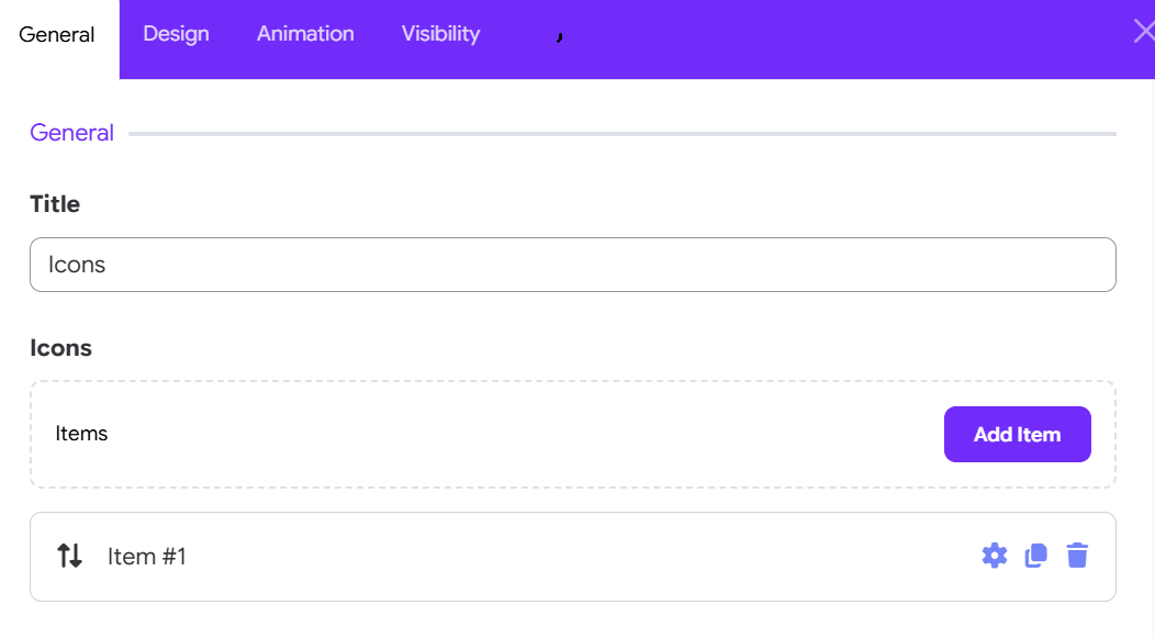
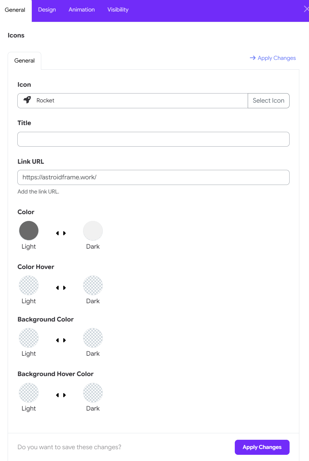
-
Title
The heading or tooltip for the icon. This can be left blank. -
Icon
Choose from the built-in icon library (FontAwesome or custom icon sets). Example:fas fa-star. -
Link URL
Add a URL to make the icon clickable. Example:https://facebook.com. -
Color: Pick the default icon color.
-
Color Hover: Choose a different color for when the icon is hovered.
-
Background Color: Choose a background color of icons. _ Background Hover Color: Choose background color of the icon when hovering the icon.
You can add multiple icons in a list format using the subform under this section.
3. Configure Icon Options
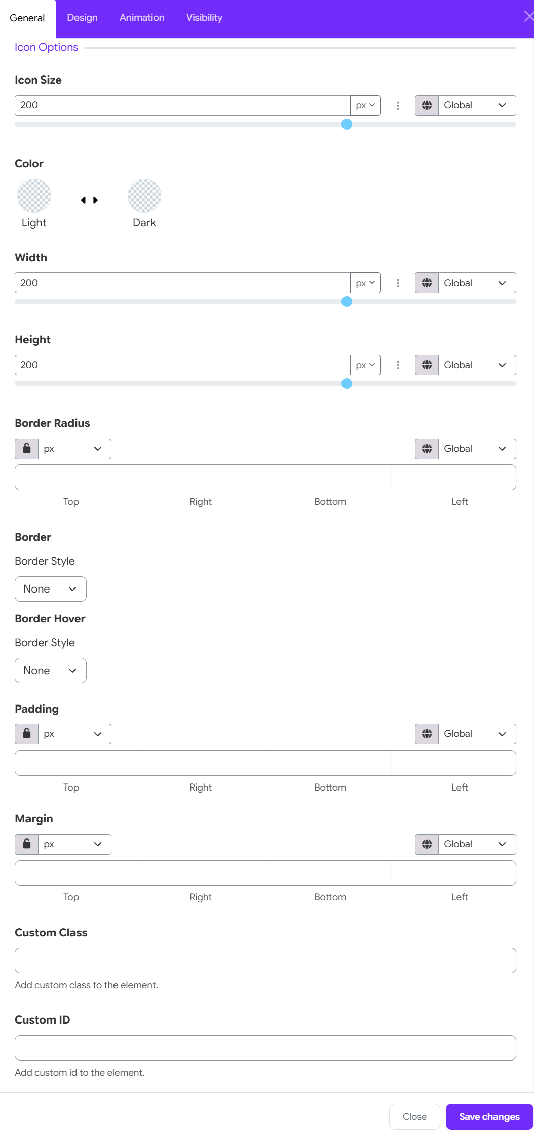
The Icon Options section allows you to customize the appearance, size, spacing, borders, and CSS settings of the icon.
Icon Size
Set the overall size of the icon.
- Enter a value manually or use the slider.
- Select the desired unit, such as px.
- Use the Global option to apply a predefined global value.
Color
Set the icon colors for different states:
- Light – Choose the icon color for the light theme or light state.
- Dark – Choose the icon color for the dark theme or dark state.
Width
Controls the width of the icon. Enter a value or adjust the slider, then select the appropriate unit.
Height
Controls the height of the icon. Adjust the value to control the icon's vertical dimensions.
Border Radius
Adjust the roundness of the icon's corners.
- Set individual values for Top, Right, Bottom, and Left.
- Use the lock icon to link the values and apply the same radius to all sides.
- Select the required unit from the dropdown.
Border
Defines the default border around the icon.
- Border Style: Select a border style such as None, solid, dashed, or other available styles. Additional border settings can be configured when a border style is enabled.
Border Hover
Controls the border appearance when the user hovers over the icon.
- Border Style: Select the desired hover border style.
- Use this option to create a visual interaction effect when the cursor moves over the icon.
Padding
Controls the internal spacing around the icon.
- Set separate values for Top, Right, Bottom, and Left.
- Use the lock icon to keep all sides synchronized.
- Select the required unit.
- The Global option can be used when a global spacing value is available.
Margin
Controls the external spacing around the icon.
- Set individual values for Top, Right, Bottom, and Left.
- Lock the values to apply equal spacing on all sides.
- Select the desired unit or use a global value.
Custom Class
Add a custom CSS class to the icon element. Use this field when you want to apply custom CSS styling or target the icon with existing theme styles.
Example: my-custom-icon
Custom ID
Add a unique CSS ID to the icon element. This can be useful for custom CSS, JavaScript targeting, or linking directly to the element.
Example: campus-icon
4. Example Use Case
You want to display three social media icons (Facebook, Twitter, Instagram):
- Add three icon items.
- Set appropriate icons:
fab fa-facebook-f,fab fa-twitter,fab fa-instagram. - Link each to the respective URLs.
- Set size to
24pxand gutter to3(medium). - Customize colors to match your branding.
5. Notes
- Icons are rendered using icon fonts. Make sure your theme includes the appropriate font library (e.g., FontAwesome).